Design Tips: Sticker Books for Illustrators
Published on 26/03/2024Design Tips: Sticker Books for Illustrators
Teacher: Carrie Knights, Collaborate Agency’s Design Manager
Sticker activity books are fun and engaging for children. They help with the development of fine motor skills, imagination, and learning abilities. Here are some helpful tips for your sticker activity book project from Collaborate Agency’s Design Manager, Carrie Knights:
The cover of an activity book is the first thing that catches the eye of a child. It should be attractive, colourful, and inviting. It should also reflect the theme and content of the book, giving a hint of what kind of activities are inside. When working with a publisher, a written brief and cover template are usually supplied to the artist or designer. This may already include placement of the title, logo, call-outs, and strapline. Consider these components when illustrating cover art. Avoid clashing or overlapping these areas and remember to allow breathing room so the design doesn’t appear cramped. If you have creative freedom with cover call-outs or straplines, try to incorporate them into your cover art in a fun and playful way (see the ‘Call-outs’ examples).
If the cover features a die-cut window showing the stickers inside, be careful of the window shape in your design. Die-cuts should not be overly complex. Avoid sharp points or protruding areas that could potentially snag or rip when handled (see the ‘Die-cut Windows’ examples).
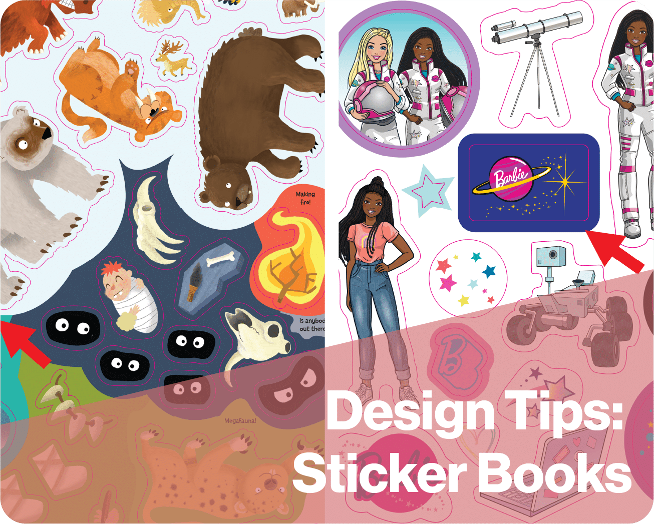
When creating stickers, check the margins and printer requirements with the publisher (they may vary). As a general rule, leave a larger margin from the gutter (spine edge) than the trim edges to prevent stickers from lifting or being damaged at the binding (see the ‘Gutter / Margins’ examples). Space the stickers according to the printer’s die-cut tolerances. This is usually 3mm between stickers with the same colour bleed, and 6mm between stickers with different colour bleeds on the same sheet (see the ‘Die-lines’ and ‘Bleed’ examples). Think about the sticker shape. Are there any long or thin areas that could easily rip when peeled from the backing sheet? Consider designs that would make a stronger sticker shape or link delicate areas together when creating the die-lines to add extra support.
For more free tips for how to improve your creative design skills subscribe to our ITSme Learning Newsletter!
Other News
How to create a perfect freelance Illustrator biography!
Learn how to write a powerful professional illustrator biography that attracts the right clients. Discover structure tips, examples, and how to create a compelling artist bio in 150–250 words.
What Happens in an ITSme Mentorship? A Week-by-Week Breakdown
Imagine having a guide who not only understands the creative path an individual wants to walk, but also has the knowledge and tools to help them get there – successfully. That’s the core of the ITSme Learning Mentorship. Whether someone is a student, a young professional at the beginning of their career, or an artist…
Announcing Our Very First Picture Book Course!
We are extremely excited to announce our first picture book class and mentorship program, in a collaboration between Caroline Wakeman Literary Agency and multi-talented author-illustrator Sally Anne Garland. Your Picture Book Journey: How to Write and Illustrate Your Own Picture Book is a 12-week course for writers, illustrators, and visual storytellers ready to bring their…
Why Every Illustrator Portfolio Needs a Stand-Out Character (Yes, Even Yours)
When you’re thinking about our favourite stories as a child, we often think about the narrative, the themes, perhaps a particular quote that stood out, but the most memorable elements are always the characters. The reason the characters always stay in our minds is because they are the gateway to the narrative, and all of…
Trend Watch: YA Illustrated Covers
Over the past few years, illustrated covers have become a defining visual language in the Young Adult (YA) and New Adult (NA) book market. And no, this isn’t just a passing trend—it’s a design evolution powered by the viral force of #BookTok, #bookgirlies, and a growing appetite for genre-fluid storytelling. Hear what’s driving the…
Trend Watch: The Graphic Novel Boom
Every week we’ll be featuring a new article over on LinkedIn, in our new trend watch series! Graphic novels are having a moment—and it’s no passing trend. From classrooms to bestseller lists, graphic novels are dominating shelves and reading time across all ages. What was once seen as a niche format with a distinct, heavy-lined “comic book”…


