How to Catch the Eye of a UK Greetings Card Buyer
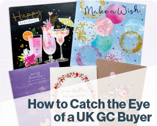
Published on 26/06/2023Greeting cards by Advocate Art illustrators Ray Shuell, Catherine Worsley, Lizzie Walkley, Millicent Venton, Louise Anglicas, Jenny Wren, Kathryn Selbert, Joanne Cave, and Di Brookes
How to Catch the Eye of a UK Greetings Card Buyer
Teacher: Deborah Millinship, Illustration Agent at Advocate Art Limited
So what makes a great Greeting card? Working in the Greetings industry for the last 12 years has given me great insight into what buyers want to see in their next best-selling range! I love working with illustrators and developing their portfolios to make them appealing to clients. The greetings industry is huge and competition is high, and every occasion warrants a card, so my advice to illustrators is to be original, follow the latest trends, create designs that appeal to the mass market and make sure you know your target age and gender.
When you come to create a design, think about the subject matter. What would be appropriate for that occasion and season? The subject matter is so important to the end consumer when they are purchasing for a loved one, a family member, a friend or even more on trend, their pets! Store shelves and online sites are packed full of options, so make it stand out, choose your colours wisely and make sure it is appropriate to the subject matter. Be mindful when using on-trend colour pallets. Don’t overcomplicate the design, keep it clean and concise.


Greeting cards by Advocate Art illustrators Simon Treadwell (left), and Joanne Cave (right)
Traditional sends should be beautiful and idyllic. For example, Christmas should be warm and cosy for those interior scenes, and a snowy wintery landscape depicts the perfect Christmas everyone is hoping for. A lovely sentimental verse also makes for a great pairing.
Consider the use of characters – if cute, you can show them in either whimsical or traditional styles. Whimsical cute being more considered, small scale, and simple in style. Sketchy with limited soft colour palettes, and the scenes in which they are placed is important. Traditional cute is fluffy, and more detailed such as soft knitted teddy bears.


Greeting cards by Advocate Art Illustrators Gareth Williams (left) and Nichola Cowdery (right)
Contemporary artwork could be more trend-led with the use of an on-trend colour palette, and witty puns and humour cards could relate to current events.
As important as the sentiment, consider the font used, does it sit well with the style and subject matter? If you don’t use text, then leave space for a caption. Most single cards are packed tight in shelving so most captions are at the top of the card for impact.
Lastly, think about your work as a collection so consider more than one card, buyers will be looking for a theme or a collection for seasonal multiview boxed cards.
Now it’s up to you to prepare some great ideas and illustrate those next best-selling greeting cards!
For more free tips for how to improve your creative design skills subscribe to our ITSme Learning Newsletter!
Other News
What Happens in an ITSme Mentorship? A Week-by-Week Breakdown
Imagine having a guide who not only understands the creative path an individual wants to walk, but also has the knowledge and tools to help them get there – successfully. That’s the core of the ITSme Learning Mentorship. Whether someone is a student, a young professional at the beginning of their career, or an artist…
Announcing Our Very First Picture Book Course!
We are extremely excited to announce our first picture book class and mentorship program, in a collaboration between Caroline Wakeman Literary Agency and multi-talented author-illustrator Sally Anne Garland. Your Picture Book Journey: How to Write and Illustrate Your Own Picture Book is a 12-week course for writers, illustrators, and visual storytellers ready to bring their…
Why Every Illustrator Portfolio Needs a Stand-Out Character (Yes, Even Yours)
When you’re thinking about our favourite stories as a child, we often think about the narrative, the themes, perhaps a particular quote that stood out, but the most memorable elements are always the characters. The reason the characters always stay in our minds is because they are the gateway to the narrative, and all of…
Trend Watch: YA Illustrated Covers
Over the past few years, illustrated covers have become a defining visual language in the Young Adult (YA) and New Adult (NA) book market. And no, this isn’t just a passing trend—it’s a design evolution powered by the viral force of #BookTok, #bookgirlies, and a growing appetite for genre-fluid storytelling. Hear what’s driving the…
Trend Watch: The Graphic Novel Boom
Every week we’ll be featuring a new article over on LinkedIn, in our new trend watch series! Graphic novels are having a moment—and it’s no passing trend. From classrooms to bestseller lists, graphic novels are dominating shelves and reading time across all ages. What was once seen as a niche format with a distinct, heavy-lined “comic book”…
Bologna 2025: A Week of Connection
By: Vicky Patoulioti, Talent Source Manager, ITSme This year’s Bologna Children’s Book Fair was one to remember. From early mornings to late evenings, our team Vicky, Bhavi, Ed, and Emily — were on the ground offering free portfolio reviews to artists from all over the world. Mornings kicked off with pre-scheduled reviews, while in the…


