Illustrating Perfect Character Eyes
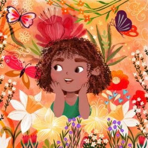
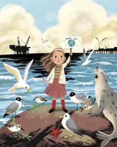
Published on 19/10/2023Illustrations from Illo Agency illustrator June Digan (left), Lera House (center), and Astound US Inc. illustrator Sheri Palmer (right).
Illustrating Perfect Character Eyes
Teacher: Kate Johnson & the ITSme Society
Here are some useful tips on the best way to approach illustrating characters’ eyes for book publishers:
We are not sure William Blake meant it in this context, but he once said, “The eye altering, alters all” and never was a truer word spoken when it comes to perfecting your characters. It’s one of the first features a reader is drawn to, whether it be human, animal or grotesque beast, so in turn, it is vital that you draw them right.

We wanted to write a blog post on this matter as the eyes are so often an afterthought; two quick dots added at the end (all illustrators have done it!), but by paying more attention to the eyes, you open the window to the soul. Allowing your character to display an endless array of emotions and expressions, which is key to bringing them to life. When the agents at the ITSme Society receive a submission, an artist’s handling of their characters’ eyes speaks volumes about their ability and craftsmanship. We know what you’re thinking, ‘Really? Something so small?!’
When reading fiction, eyes are often described to symbolize a great deal about a character. It may be an overused metaphor, but rather than saying ‘The girl was excited,’ an author may instead describe the girl’s eyes as ‘lighting up.’ This notion of showing and not telling can transfer to image making too! Eyes come in an assortment of colors and shapes – a beast’s eyes could even change color as they glare out of the page at the reader. Eyes can glint when we beam with excitement, or turn upwards and dilate when frustrated. They can dart in any direction. Or they can be decorated. The glasses a character wears could symbolize so much about their personality and situation. Have their parents bought their book-loving son a pair that comically magnifies his eyes? Or have a pair of woodland animals who love to sing decorated their faces with star-shaped, tinted shades? There is a lot to consider!

The ITSme Society agencies noticed past trends of the UK liking dots for eyes, and the USA preferring whites to the eyes. However, even that is changing. There are always exceptions to this rule, but a well-formed eye on a character can be something that makes or breaks your publishing portfolio. Certainly, adding a brow and a little expression in the mouth helps convey the emotion. But often by considering simple variations to the eyes of your beautiful character, you can transform them to a whole new level, help tell their story and define their personality. Adding whites and pupils truly adds the ability to open up your character and depict a depth of emotion and expression impossible with simple dots – no matter how much you play them up. As Marcus Tullius Cicero said, “The face is a picture of the mind, with eyes as its interpreter.” So, play around with eyes in your character sketches, and you’ll learn more about them than you thought possible. Make sure to have fun with your experiments and you’ll soon find your pages thriving with personality!
For more free tips for how to improve your illustration portfolio, subscribe to our ITSme Learning Newsletter!
Other News
What Happens in an ITSme Mentorship? A Week-by-Week Breakdown
Imagine having a guide who not only understands the creative path an individual wants to walk, but also has the knowledge and tools to help them get there – successfully. That’s the core of the ITSme Learning Mentorship. Whether someone is a student, a young professional at the beginning of their career, or an artist…
Announcing Our Very First Picture Book Course!
We are extremely excited to announce our first picture book class and mentorship program, in a collaboration between Caroline Wakeman Literary Agency and multi-talented author-illustrator Sally Anne Garland. Your Picture Book Journey: How to Write and Illustrate Your Own Picture Book is a 12-week course for writers, illustrators, and visual storytellers ready to bring their…
Why Every Illustrator Portfolio Needs a Stand-Out Character (Yes, Even Yours)
When you’re thinking about our favourite stories as a child, we often think about the narrative, the themes, perhaps a particular quote that stood out, but the most memorable elements are always the characters. The reason the characters always stay in our minds is because they are the gateway to the narrative, and all of…
Trend Watch: YA Illustrated Covers
Over the past few years, illustrated covers have become a defining visual language in the Young Adult (YA) and New Adult (NA) book market. And no, this isn’t just a passing trend—it’s a design evolution powered by the viral force of #BookTok, #bookgirlies, and a growing appetite for genre-fluid storytelling. Hear what’s driving the…
Trend Watch: The Graphic Novel Boom
Every week we’ll be featuring a new article over on LinkedIn, in our new trend watch series! Graphic novels are having a moment—and it’s no passing trend. From classrooms to bestseller lists, graphic novels are dominating shelves and reading time across all ages. What was once seen as a niche format with a distinct, heavy-lined “comic book”…
Bologna 2025: A Week of Connection
By: Vicky Patoulioti, Talent Source Manager, ITSme This year’s Bologna Children’s Book Fair was one to remember. From early mornings to late evenings, our team Vicky, Bhavi, Ed, and Emily — were on the ground offering free portfolio reviews to artists from all over the world. Mornings kicked off with pre-scheduled reviews, while in the…


