Kids vs Adult Oriented Birthday Card Tips
Published on 06/02/2024Card designs by Advocate Art illustrators Jennie Bradley, Jo Little, and Lynn Horrabin.
Kids vs Adult Oriented Birthday Card Tips
Teacher: ITSme Creative and Course Director Bhavi Patel

Within the Greeting Card market, we tend to find that artistic styles naturally tend to appeal to specific age groups based on the overall look of the design, colour palette, level of detail and content. But when you’re trying to branch out into an age group which is outside of your niche, there are a few things you can consider to help make your work appealing to different target audiences.
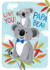
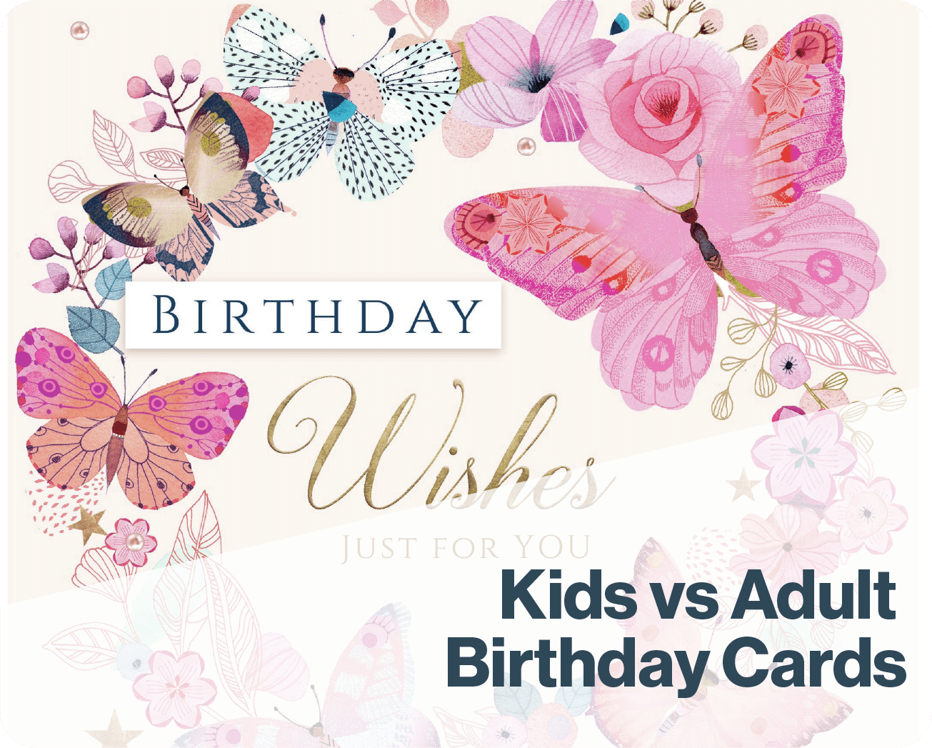
All of the factors mentioned above have a direct impact on where your design will sit in the market, and what audience it gravitates to. The first is the colour palette; we tend to notice that brighter, bolder tones work well for kids’ birthday cards, whereas adult cards are capable of holding a more pastel, muted or even a limited colour palette. Similarly with levels of detail, kids’ cards usually have one or two clear points of focus to draw in the recipient’s attention, which also build a narrative within the card design. Adult cards tend to steer more towards the decorative angle, focusing on particular subject matters to make the focus of the occasion more obvious. The content and colour palettes combined then determine the gender the cards are targeted to. We also notice that with fully illustrated scenes, the adult cards also focus on being more decorative whilst showcasing a number of finer details for the receiver to appreciate.
The biggest element which differentiates whether a card design is suitable for a kids’ send, or adult, is the way the card interacts with the recipient. Kids’ cards are driven by character focused designs as they give the recipient the opportunity to see themselves in the card either through physical appearance, or personality traits/ interests. They also help to build narratives, taking you on a journey, whilst also building a cast and brand along the way.
Whilst characters can be adapted into various sending situations, we find that figures in adult cards are more impressionist. The focus is on the overall design, including the secondary elements which form around the character.
For more free tips for how to improve your creative design skills subscribe to our ITSme Learning Newsletter!
Other News
What Happens in an ITSme Mentorship? A Week-by-Week Breakdown
Imagine having a guide who not only understands the creative path an individual wants to walk, but also has the knowledge and tools to help them get there – successfully. That’s the core of the ITSme Learning Mentorship. Whether someone is a student, a young professional at the beginning of their career, or an artist…
Announcing Our Very First Picture Book Course!
We are extremely excited to announce our first picture book class and mentorship program, in a collaboration between Caroline Wakeman Literary Agency and multi-talented author-illustrator Sally Anne Garland. Your Picture Book Journey: How to Write and Illustrate Your Own Picture Book is a 12-week course for writers, illustrators, and visual storytellers ready to bring their…
Why Every Illustrator Portfolio Needs a Stand-Out Character (Yes, Even Yours)
When you’re thinking about our favourite stories as a child, we often think about the narrative, the themes, perhaps a particular quote that stood out, but the most memorable elements are always the characters. The reason the characters always stay in our minds is because they are the gateway to the narrative, and all of…
Trend Watch: YA Illustrated Covers
Over the past few years, illustrated covers have become a defining visual language in the Young Adult (YA) and New Adult (NA) book market. And no, this isn’t just a passing trend—it’s a design evolution powered by the viral force of #BookTok, #bookgirlies, and a growing appetite for genre-fluid storytelling. Hear what’s driving the…
Trend Watch: The Graphic Novel Boom
Every week we’ll be featuring a new article over on LinkedIn, in our new trend watch series! Graphic novels are having a moment—and it’s no passing trend. From classrooms to bestseller lists, graphic novels are dominating shelves and reading time across all ages. What was once seen as a niche format with a distinct, heavy-lined “comic book”…
Bologna 2025: A Week of Connection
By: Vicky Patoulioti, Talent Source Manager, ITSme This year’s Bologna Children’s Book Fair was one to remember. From early mornings to late evenings, our team Vicky, Bhavi, Ed, and Emily — were on the ground offering free portfolio reviews to artists from all over the world. Mornings kicked off with pre-scheduled reviews, while in the…


