Why Layout is Key to GC sales: From Vertical to Horizontal to Square
Published on 04/01/2024


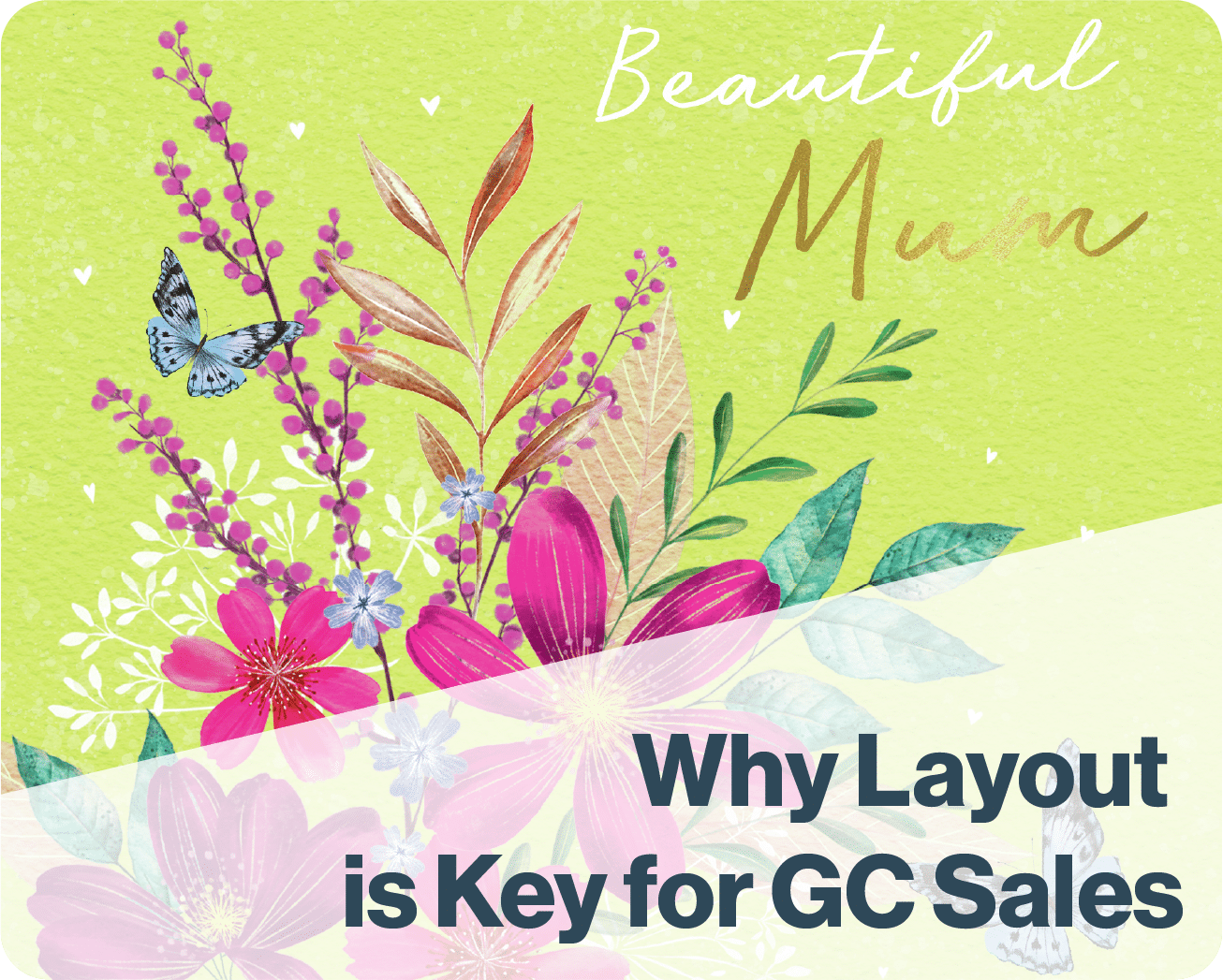
Greeting Card designs by Advocate Art illustrators Charlotte Pepper, Jane Ryder-Gray, Di Brookes, and Daniel Rodgers.
Why Layout is Key to Greeting Card Sales: From Vertical to Horizontal to Square
Teacher: ITSme Creative Director and Advocate Art Art Director Bhavi Patel
When it comes to designing for Greeting Cards, there are some key fundamental things to keep in mind which can help elevate your overall design, making it sellable. Whether your design is in a portrait, horizontal or square format, the first things to consider are what your subject matters are going to be, and the focus of your design. The second element to consider is the placement of text, because this is one of the first things a consumer will look at when finding a card.
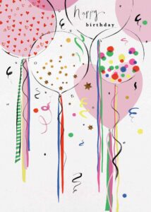
The most common format for greeting cards is portrait, 5×7 specifically. Most icons and characters can sit comfortably in a portrait format, despite its long, rectangular shape. Portrait formats are great for characters, alongside singular icons. These individual icons can also be used to create more complex shapes, by treating different icons as building blocks.
Horizontal cards are great for panoramic scenes and illustrations with more detail in them, along with cards that are more text focused too. I have found that seasonal cards, especially Christmas scenes and landscapes, work perfectly for a horizontal format as it gives breathing room for the subject matter and details, without it feeling overcrowded.

Square layouts are generally the most versatile, and are great at being able to hold illustrations which span from scenes and icons, as well as typography and decorative illustration. The uniform size and shape of the card allows the overall design to feel well balanced.
With this in mind, the last element to consider is making sure that whatever format your card is in, it can be adaptable to different sizes/ formats, whilst leaving room for the text to sit in the top third of the design. If you imagine a card display in a shop, having the text in the top third allows the consumer to easily find the right card for them based on the occasion and relation they are buying for.
For more free tips for how to improve your creative design skills subscribe to our ITSme Learning Newsletter!
Other News
Why Every Illustrator Portfolio Needs a Stand-Out Character (Yes, Even Yours)
When you’re thinking about our favourite stories as a child, we often think about the narrative, the themes, perhaps a particular quote that stood out, but the most memorable elements are always the characters. The reason the characters always stay in our minds is because they are the gateway to the narrative, and all of…
Trend Watch: YA Illustrated Covers
Over the past few years, illustrated covers have become a defining visual language in the Young Adult (YA) and New Adult (NA) book market. And no, this isn’t just a passing trend—it’s a design evolution powered by the viral force of #BookTok, #bookgirlies, and a growing appetite for genre-fluid storytelling. Hear what’s driving the…
Trend Watch: The Graphic Novel Boom
Every week we’ll be featuring a new article over on LinkedIn, in our new trend watch series! Graphic novels are having a moment—and it’s no passing trend. From classrooms to bestseller lists, graphic novels are dominating shelves and reading time across all ages. What was once seen as a niche format with a distinct, heavy-lined “comic book”…
Bologna 2025: A Week of Connection
By: Vicky Patoulioti, Talent Source Manager, ITSme This year’s Bologna Children’s Book Fair was one to remember. From early mornings to late evenings, our team Vicky, Bhavi, Ed, and Emily — were on the ground offering free portfolio reviews to artists from all over the world. Mornings kicked off with pre-scheduled reviews, while in the…
How to Beat AI and Catch the Client’s Eye
Illustration by Camipepe By: Edward Burns, CEO, ITSme As AI art tools become more sophisticated, it becomes more important to emphasize our value and status as authentic human artists. Crafting a great bio and portfolio is an excellent way to make an immediate impact. They should allow the client to get to know you in…
Be A Pro at Curating Your Portfolio!
You asked, and we listened! Be A Pro at Curating Your Portfolio; our new course is here! Learn all the secrets to crafting a standout portfolio with 4 Hours of Expert-Led Content! One of the biggest challenges you face in your illustration career is presenting your work in a way that catches the eye of…