Cards are designs like any other product – they are designed for a specific purpose. Do not think of a card as a piece of art on a piece of paper, think of it as an image that encompasses a sending situation (e.g. New Baby or Happy Birthday). But then, just as important, the design must have empathy between the sender and recipient. For example, 2 teenage girls will send cards about going out shopping, whereas 2 elderly ladies will send cards with bouquets of flowers on. Once you think of your image as a design, you will be seriously increasing your chances of being picked up by Greeting Card publishers and winning commissions.
- On average, 70% of cards are purchased by women, and 70% of that are women buying for other women, which means there are a lot more feminine designs in the market than male.
- You need to be able to let the customer know what they are buying as soon as they look at the design. On average you have a 3rd of a second to let the customer know what and who the card is for, and in supermarkets that time is reduced even further. Make the design as clear as possible to try and get the most attention from the customer.
- Just like any fashion industry, card design occupies a narrow trend parameter. It can be very easy to be ahead of trend, on trend or off trend altogether! Don’t try to be too innovative at first, it would be much better for you to do versions of existing compositions in your style then to try and reinvent what is fashionable in the Greeting Card industry. Imagine if you were a clothes designer, and you were asked to design a new line of girl’s clothes with no concept of what decade you were in. You can imagine how terrible the results would be. The same goes for Greeting Cards; you need to be aware of where the trend is and be right on it.
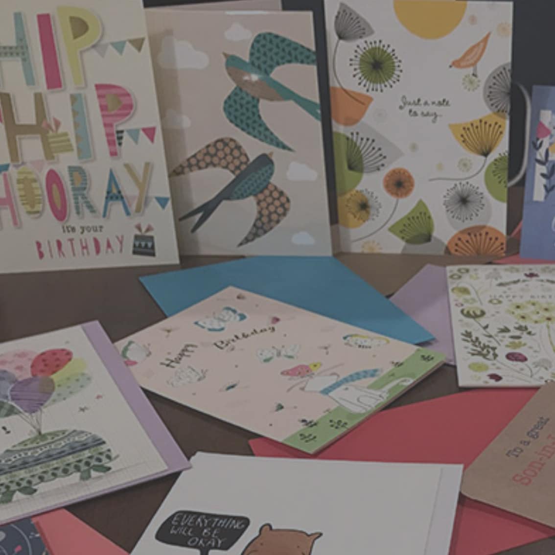
- Covering all bases. Take a look at the different occasions and try and get at least 1 or more design in each of the sections. Clients like to see new designs, so by sending work regularly you are showing them you are still working and winning commissions. As you will see some captions are more popular than others, but they are the different themes, so good to try them all.
- Keep up to date with your competition, look in the shops you want your designs to be sold in, check out the resources part of the website and the blog for the latest trends we see coming through from clients.
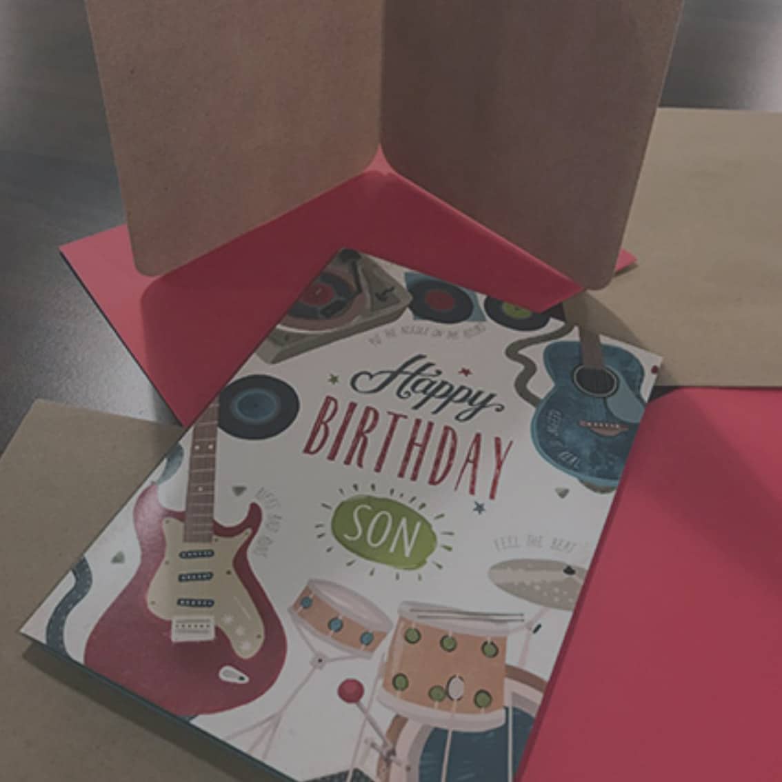
- Character Design. You need to consider the sending situation when creating characters. Who the design is aimed at, and who it is intended to be from. This will affect what the characters are doing in the design, and what characters you include. E.g. a dad sending a card to his son would have 2 characters that are the same type (bear, fox, owl etc…) but one larger than the other, perhaps playing a game. Whereas, a friend giving a design to card to another friend could have 2 characters or more but with different types of characters (a bear and a fox) decorating a cake, holding some flowers etc.
- Play to your strengths. Know what you are good at and make sure these are a key element to your designs. It is always good to freshen up your work, but try and keep the fundamentals the same.
- When painting people into designs, try not to show them face on, as the customer buying the design needs to be able to put their own interpretation into it. They need to be able to picture someone they know in the design. You can always obscure the face with an object, or paint it loosely so it could appeal to more than one person.
- When working on designs, try and work in ranges of 4 designs to show the client variations of a similar look. We mock up designs that stand out to take with us to meetings and shows, and can often brief more designs to create a range if we see one design with potential. You need to make sure that the designs work as a range by having similarities such as the colour palette or the characters used in the design or the layout, but the designs cannot be too similar, they need to have different elements. A good combination for a range would be 2 x female birthday designs, 1 x male birthday designs and 1 x other occasion. We do not mock up Christmas designs, so best not to include in your 4, but there is no reason why you can’t include a Christmas version for your digital portfolio, or create Christmas ranges.
- Christmas Ranges. Agencies do not always mock up Christmas ranges, but can do if they are really striking, and it helps as a lot of clients look for Christmas cards in pairs or sets of 4, so it is worth keeping them in a range where possible. The designs are used for boxed cards, cards displayed in a cube and also for bags, so try and work with at least 4 designs in a Christmas range.
- Designs aimed at a younger audience need to sit separately to the ranges mentioned above. Juvenile designs often cover Male and Female Designs separately, from ages 1-6. You need to consider the age difference when working on these, as a 1 year old will not be into the same thing as a 6 year old. There needs to be consideration of the sending situation for each card and what would be appealing and appropriate. Animals are often used in children’s designs as they appeal to a wider audience.
- Male and Female. Make sure you have a mixture of Male and Female designs in your portfolio. Although the facts show that Female to Female card sales are the most popular, there still need to be cards aimed at men, and they are always the ones we struggle to find. Variety is key.
- Changing the colour palette on a design can give it a completely different look. A good website to use for a colour tool is www.kuler.adobe.com that allows you to upload images with colours in that you like, and it will create a colour palette based on this. There are also suggestions of colour palettes that other people have created which would be a great place to start with designs.
- Card retailers tend to go for either Portrait 5” x 7”, or Square 16cm x 16cm for their card sizes, so try to stick to one of these sizes when creating new designs, unless you are given a more specific size from the client/Advocate.
- Try and remember to include a 5mm bleed around the design as it will help the client when it goes to print.
- Text needs to be within the top 3rd of the card when designing for counter cards, so the customer can see who the card is aimed at when looking through the selection. It needs to work with the design too, clients can be put off when bad text is put into a design, so if you are not confident when using text, just leave a space for it but don’t worry about adding it in. Make sure the text is on a separate layer to the artwork if you choose to add it, so it can be removed or edited easily without affecting the design.
- Try and think of different ways of formatting designs. There are several ways to try different formats:
- Look on the resources part of website for ideas of formatting
- Increase the negative space
- Try changing the character size around – it can give a different feel
- Borders/Frames – not always appropriate but could add something to the design
- Obviously this varies for digital and traditional ways of working, here are some tips for each:
- When setting up a document digitally, make sure the file is CMYK and at least 300dpi. Try working in layers, make sure each layer is labeled correctly, and similar layers are grouped together to prevent having 100s of layers loose in a file. Make sure text is on a separate layer to artwork in case it needs to be edited or removed.
- Traditional paintings need to be worked on slightly larger than intended, as the artwork will look tighter when scanned in. I would recommend working 150% instead of 100% against the size required. When scanning, scan at least 300dpi, and it is always worth tidying up the file digitally afterwards to make sure there are no unwanted marks.
- Sending in Files. There are several websites you can use to send over HR files that are too larger to send as an email attachment. You can use one of the following if you are unsure of what program to use, as well as many others out there.
- wetransfer.com
- yousendit.com
- Drop Box