What to Have In Your Graphic Novel Illustration Portfolio
Published on 06/05/2024


Illustrations by Astound US Inc. illustrators Alessia Trunfio, Alex Lopez, Fran Bueno, Karen De La Vega, Markia Jenai, and Pedro Rodriguez
What to Have In Your Graphic Novel Illustration Portfolio
Teacher: Aurora Barlam, Senior Agent, Astound US Inc
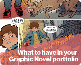
We all know graphic novels are a growing field! Despite that, comics can still be a tough industry to break into. In order to make your portfolio stand out, here are my top tips on what to have in your graphic novel illustration portfolio.
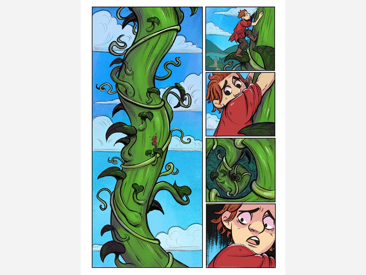
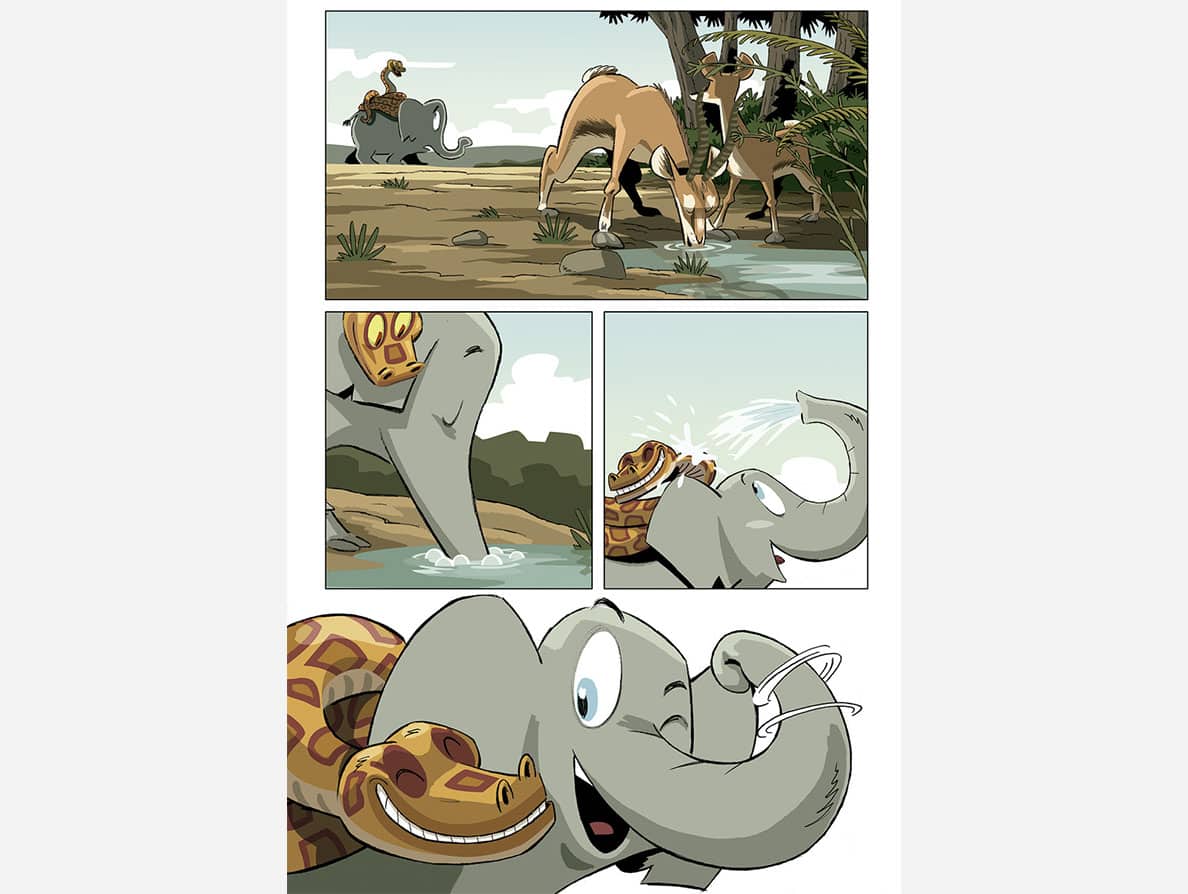
I suggest staying competitive by including both inked black and white art and fully colored art in your portfolio (even though you can work with inkers and colorists on published books). Your skills with both line quality and color palettes will definitely impress editors (pro tip about color palettes: carefully choose how much purple you use, since this color is often overused in comic book art). You can also show character designs in your portfolio, along with fan art of licensed characters if you dream of illustrating your favorite superheroes, TV shows, movies, and toy franchises. The absolute most important thing to include in your portfolio is sequential art.
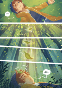
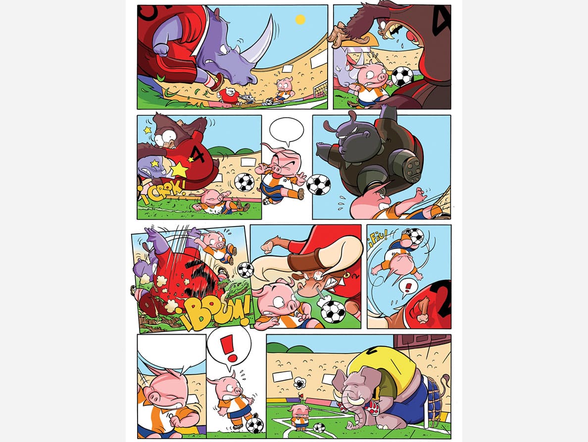
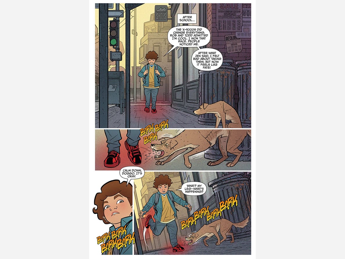
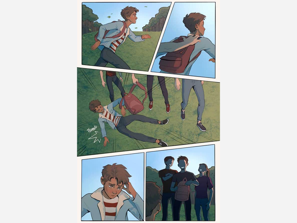
Sequential art means an illustration that uses multiple panels to tell a story. The term covers everything from newspaper comic strips to elaborate spreads in graphic novel volumes. Graphic novel pages tend to be around 2:3 dimensions and often have 3-9 panels a page (depending on the age range the story is targeted to: less panels for younger audiences, more for older audiences). When designing a composition for a page, consider how to show the action going from one panel to the next. Think of each panel like a frame in a movie. For example, in a story where a kid kicks a ball, you draw the kid and ball in one panel, the foot hitting the ball in the next, and then show where the ball goes. With such a simple prompt, you can probably imagine so many creative ways to visually tell this tale.
When looking at your sequential art, editors will ask themselves:
- Does the action from one panel to the next make sense? For example, if in one panel the ball is on the ground, and then in the next, the ball is in the air, then you need a panel in between where that ball is kicked into the air.
- Is every action explained in the story? If the next page has an adult holding the ball, then where did they pick it up?
- How are you leading the eye through the panels? Draw the reader’s attention to the most important characters and objects within panels, then direct their eyes from one panel to the next in the right order. Also, watch out for tangents that might confuse the reader (for example, straight lines from the top to the bottom of panels can be confused for panel borders).
- Is it dynamic? Try to make a visually interesting composition that your readers will want to explore. Detailed, well-designed backgrounds often separate amateur art from professional art. When everything else is beautifully detailed, you can use more simple panels for visual impact, like a close-up shot in a movie.
Make sure your art answers all these questions! Once you master the basics, there are lots of fun ways to bend the rules, like showing characters fall out of panels or getting rid of the panel borders altogether. After putting this insider knowledge into practice, your portfolio will be sure to impress.
For more free tips for how to improve your illustration portfolio, subscribe to our ITSme Learning Newsletter!
Other News
How to illustrate kids’ puzzles: from simple to complex!
How to illustrate kids’ puzzles: from simple to complex! Teacher: Bhavi Patel, Advocate Art Agent/ ITSme Learning Almost every theme and subject matter can be adapted to both kid and adult age groups; the key element that differentiates the two is the level of difficulty. This is determined by how much detail is in the...
New Signed Artist: Carolina Coroa
Carolina was born in Belém, north of Brazil, a city well-known for its exuberating nature and strong native culture. She graduated two times, in Communication and in Fashion. After finishing her master at Istituto Europeo di Design in São Paulo, she worked for 6 years creating prints and patterns for fashion companies, running her own design studio and studying...
Calling out to all Creatives!
Are you looking for an Internship? A great opportunity to learn at one of the top illustration agencies in the world. Make sure you send us an email at: hello@itsme.biz
New Signed Artist: Katie Crumpton
I was born in South Carolina in 1992 but now I’m currently living in the Bay Area. I moved to California to attend the Academy of Art University and graduated with a bachelor’s degree in illustration in 2016. I started drawing from a very young age and was too stubborn to stop. I get inspired...
New Signed Artist: Hana Augustine
I am a 27 yo self taught artist from Indonesia. Since my early childhood I have always had pen and papers with me, I would observe and draw. Drawing has become a medium that speaks to my heart. I grew up with lots of children’s books and fairy tales, I was captivated by their worlds...
New Signed Artist: Daniela Tordi
Daniela Tordi is born in Orvieto, a medioeval town in central Italy. Her childhood memories deal with the frescos of a giant cathedral, real tales from the past. She started illustrating as a self-taught in her thirties, asking to writers for adults to write a children’s story as a special gift. This collaboration, among other...